Advanced DataTable
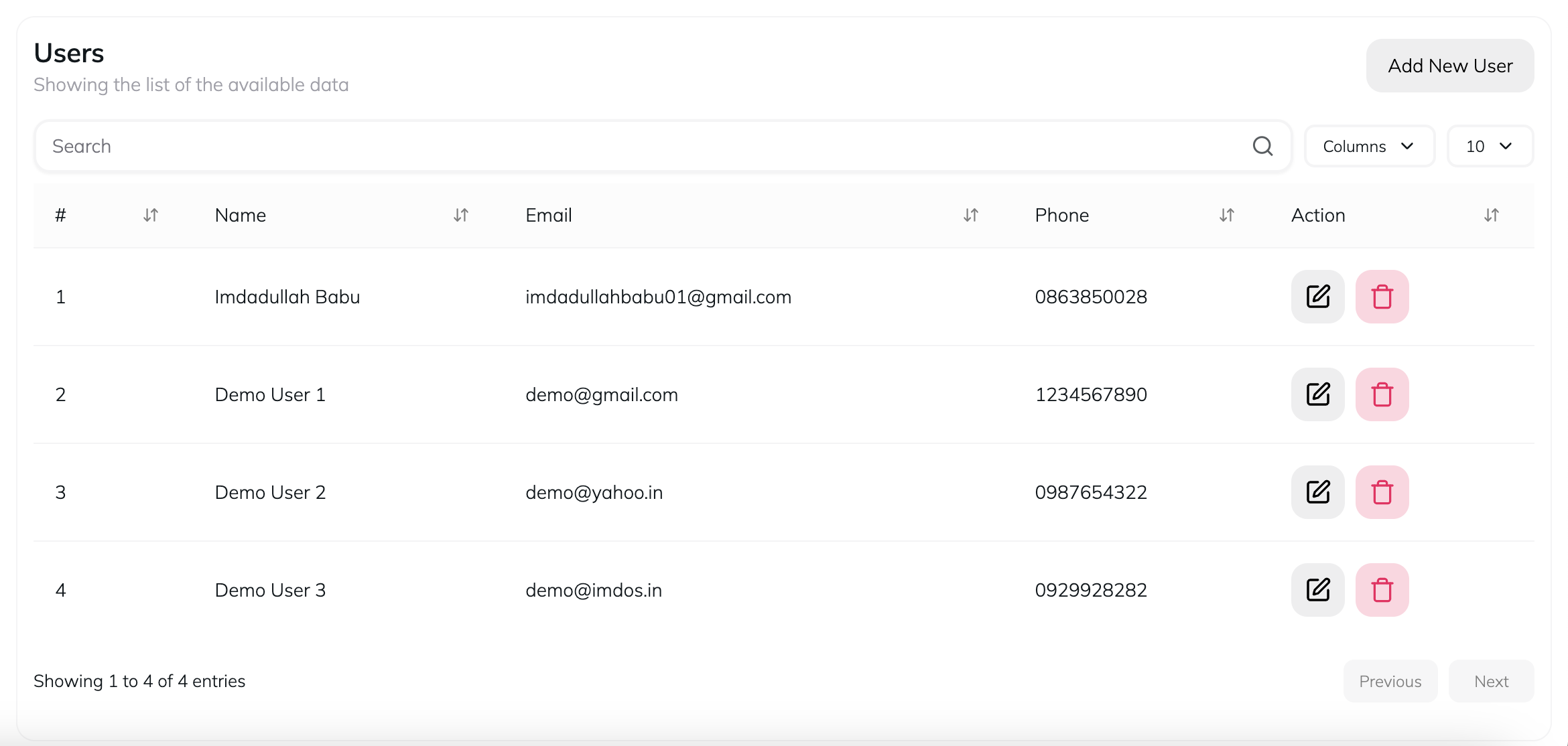
Features
DataTable component that renders a data table with various columns and header with some additional features which are mentioned below
- Pagination - Efficiently navigate through large sets of data by breaking it into manageable pages, enhancing user experience and performance.
- Search - Quickly find specific information within your data by entering keywords or phrases, improving data accessibility and usability.
- Columns - Organize your data into distinct columns, allowing for clear and structured presentation, making it easier to analyze and interpret.
- Per Page - Control the number of data entries displayed per page, providing flexibility to adjust the view according to user preferences or needs.
- Responsive - Ensure your data tables are fully responsive, adapting seamlessly to different screen sizes and devices for optimal viewing experience.
- Easy Integration - Simplify the process of integrating data tables into your application, reducing development time and effort.
- Customizable Column - Tailor the appearance and behavior of individual columns to meet specific requirements, offering a personalized data viewing experience.
Setup Columns
The tableColumns array defines the structure and behavior of each column in the table.
Serial Number Column:
id- Unique identifier for the column.header- The header text displayed for the column.enableHiding- Boolean to disable hiding of this column.accessorFn- Function to access data for this column. Here it converts the row data to a JSON string.cell- A function that defines how each cell in this column is rendered. Here it shows the index of the row incremented by one.
Name, Email, and Phone Columns:
accessorKey- Key to access data in the row object.header- The header text displayed for the column.cell- A function that defines how each cell in this column is rendered. Here it displays the respective data from the row.
Action Column:
accessorKey- Key to access data in the row object.header- The header text displayed for the column.cell- A function that defines how each cell in this column is rendered. Here it displays the respective data from the row.
DataTable Component
The DataTable component is used to render the table.
import DataTable from '@/components/imdos-ui/data-table';Props:
description- A description of what the table manages.title- The title of the table.columns- The array of column configurations defined earlier.data- The data to be displayed in the table.endContent- Additional content to be rendered at the end of the table. Here it includes a button to add a new user.