Form Validation
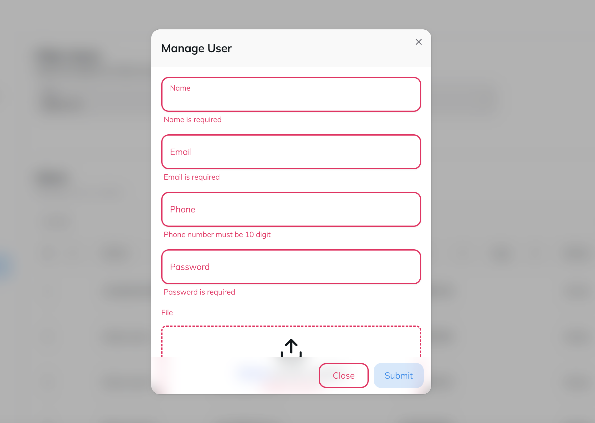
Instructions
This documentation will guide you through the creation of a dynamic form with validation using the zod library and a custom schema creation function from the imdos library. The form includes fields for name, email, phone, password, and image upload, each with specific validation rules
Form Fields Configuration
The formFields object defines the structure and validation rules for each form field.
Import the components and functions:
Name:
title- The label for the field.type- The type of input(text).default- The default value for the field.validation- Azodschema to ensure the field is not empty.
Email:
title- The label for the field.type- The type of input(text).default- The default value for the field.validation- Azodschema to ensure the field should be a valid email.
Phone:
title- The label for the field.type- The type of input(number).default- The default value for the field.validation- Azodschema to ensure the field contains exactly 10 digits.
Password:
title- The label for the field.type- The type of input(text).default- The default value for the field.validation- Azodschema to ensure the field is not empty.
Image:
title- The label for the field.type- The type of input(file).default- The default value for the field.validation- Azodschema to ensure a file is provided.
Supported type and validation rules
The Form component support these types with the given validation schema rule.
Radio:
type- radiooptions- An array with the objects oflabelandvalue-
validation-z.string({required_error: 'This field is required'})
Date Picker:
type- date-
validation-z.any().refine((val) => val?.length != 0, 'This field is required')
Date Range Picker:
type- date-range-
validation-z.any().refine((val) => val?.length != 0, 'This field is required')
Textarea:
type- textarea-
validation-z.any().refine((val) => val?.length != 0, 'This field is required')
Checkbox:
type- checkbox-
validation-z.any().refine((val) => val, 'This field is required')
Auto Complete:
type- auto-completeoptions- An array with the objects oflabelandvalue-
validation-z.any().refine((val) => val?.length != 0, 'This field is required')
Dropdown:
type- selectoptions- An array with the objects oflabelandvalue-
validation-z.any().refine((val) => val?.length != 0, 'This field is required')
Multiple Select Dropdown:
type- select-multipleoptions- An array with the objects oflabelandvalue-
validation-z.any().refine((val) => val?.length != 0, 'This field is required')
File:
type- file-
validation-z.any().refine((val) => val, 'This field is required')
Hidden:
type- hidden-
validation-z.any().refine((val) => val?.length != 0, 'This field is required')
Input:
type- text, number etc.-
validation-z.string().refine((val) => val?.length != 0, 'This field is required')
Form Component
The Form component uses the imdos.createSchema function to create a validation schema based on the formFields configuration.
Props:
schema- The validation schema created using the imdos.createSchema function.variant- A string indicating the variant style of the form (e.g.,bordered,underlined,flat).onSubmit- A function to handle form submission.